

Reimagining a new UM chatbox experience for students.
Role
UX designer, UX Researcher
Tools
Figma
Duration:
3 months (Sep 2024 - Dec 2024
Client
Micheal Hess
As part of my SI 307 final project, I redesigned one of UM’s AI chat platforms, conducting usability tests and iterating the design, culminating in a prototype selected for presentation to the ITS team from over 150+ students.


At the start of the project, our class met with Michael Hess, the lead of ITS Services at UM, to discuss goals for UM’s newly created AI tools (UM Maizey, UM-GPT, and Mi-Maizey). As the first university to create a student-centered AI platform, Micheal stressed the need for a tool that sets a high standard for innovation while addressing student needs.
Micheal Hess emphasized the following core issues across all 3 platforms:


So, how might we design something that…
Empowers students through clarity, personalization, and seamless interaction?
Putting it into perspective
Along with the issues Michael Hess pointed out, it’s just as important to look at what real U of M students are saying about the current models and what they’d like to see improved.
AI is a huge part of college life now, so it’s important to create tools that actually work for students. Check out these stats:

I also asked a few friends and current students attending UM their thoughts on the current UM AI platforms. Here’s what they said:

PHASE 1 Ideation
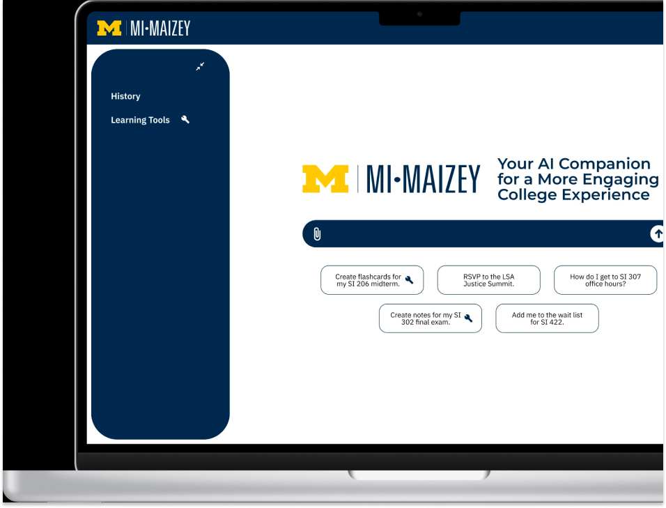
Redesigning just one platform didn’t make much sense, so I decided to combine all three platforms instead. This way, I could pull in the best features from UM-GPT, Mi-Maizey, and the UM-Maizey, cutting out redundancy and creating a more streamlined, unified AI tool for students.
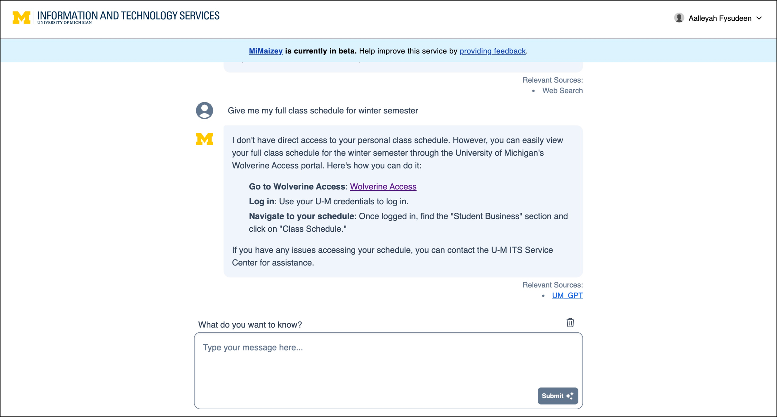
To understand the issues with the latest UM AI model (Mi-Maizey), I conducted a usability test on it with 3 current UM students.
To view the full usability report, click here:

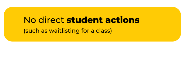
Issues Identified


Based off the insights I gathered from Micheal Hess, fellow UM students, and testing on the current website, I created a problem statement, and for each part of the statement, I came up with as many solutions as I could to solve that part. Below is the problem statement split into 3 main issues, and solutions to solve each of those 3 main issues in the same highlighted color.


User Flow
To effectively plan the app's structure and ensure a seamless user experience, I began by creating a detailed user flow diagram. This allowed me to map out the app's navigation and interactions, providing a clear foundation before progressing to the design of low-fidelity wireframes.

Lo-fi Wireframes
After finalizing my design decisions, I started by creating low fidelity wire frames to perfect the basic structure of the pages. During this project, I was taught how to use autolayout in Figma to make the design responsive.

Action-based response to streamline processes.

Multi-modal options to interact beyond text.

Indicate which sources are used per response, rate response, and show confidence levels.

Add personal sources and view current sources.

Chat with other UMich students and send chat strings from personal history.


I also created mobile versions of these wire frames to ensure accessibility across devices.
Usability Testing
We conducted usability testing with three users over a 30-minute session, using the Mi-Maizey prototype as the focus. Participants were given four tasks to complete, allowing us to observe their interactions and gather valuable insights.
Key Findings
2

User misinterpreted the + icon to be a read more button instead of an add source button on the sources page.

I moved the + icon outside of the box so as to not confuse the user of its purpose to add a source.


3
The user found the instructions for the learning tools unclear, particularly regarding what happens after the icon is placed in the search bar.

Added a overlay to explain to the user how the flashcard learning tool works before they use the tool.
1
The user was confused about the information displayed on the sources page and found it to be overwhelming.
Utilize a drop-down arrow for text to limit the text on screen.
Walkthrough of Final Design
Here’s the final prototype of Mi-Maizey. Press play below to watch a complete walkthrough of the app!