Role
UX designer, UX Researcher
Tools
Figma, Canva
Duration:
6 weeks (July 2024 - Aug 2024
Client
GDYT, WSU Honors, Rocket Companies
During this project, I served as a tech coach, teaching high school students UX design and research by designing an educational mobile app. Detroit Achieve centralizes resources like internships, workshops, and mentorships while fostering a supportive community. Its goal is to empower peers to achieve academic and professional goals.

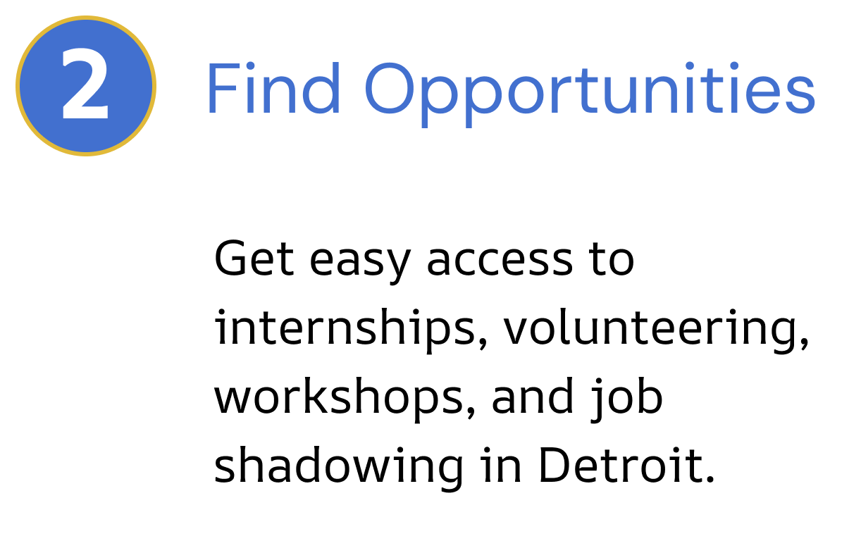
Key Features


Let’s break my full process down


As a team who were all high school and college students, we understood how difficult it can be to find local opportunities or a learning community that was catered to Detroit students. It’s something we cared about fixing after brainstorming ideas over multiple sessions as a team.
Here are some key points we discussed while brainstorming the problem we aimed to address for the DPS community..


Key Questions & Objectives
As a team, we decided to focus on the lack of proper integration of educational resources in Detroit public high schools. Before jumping into solutions, we came up with a few questions to ask real students to understand how they were experiencing the issue and whether it was even a real problem in the first place.

What are the biggest challenges students face when studying for a class, and what could make them easier to overcome?
What barriers do students face when trying to access academic or professional advancement opportunities within Detroit?
Do students ever find it overwhelming when searching for mentorship, academic help, or career help catered toward their needs?
Who’s the user?
When sending out surveys to 14 DPS students, we discovered that most of them fit into one of two personas/archetypes. These personas were key because they showed that while everyone faced the same core issue, it showed up in different ways across their lives.


“ I find it difficult to find resources because everything is in a different spot—Google, multiple apps, scattered files, and various platforms. “
How does Ramon experience the main pain point:
“My school doesn’t really have helpful career counseling so its hard for me to find career resources because of this“
How does Alex experience the main pain point:
Survey Analysis
After conducting surveys, we categorized the responses into 11 distinct groups and assigned corresponding themes to each, reflecting users' experiences to better organize our data.
Through analyzing the groupings and noticing the key themes noted in the diagram, we observed that nearly all participants mentioned at least one, if not all, of these three issues across all questions.


BSA (Bad, Simple, Amazing)
At this point, our group was brimming with ideas. To address our three pain points, I led an activity where each member proposed bad, simple, and amazing solutions to solve our pain points, generating 20+ features and ideas. We narrowed these down to five key sections of the app that best solved our issues. Heres a walkthrough of what features we ultimately decided to add and what pain point it helped solve.
Pain Point 2,3 Solved
Pain Point 2,3 Solved

Pain Point 2,3 Solved
Pain Point 1,3 Solved
BSA Round 2
Pain Point 3 Solved
With these high-priority design requirements and foundational solutions in mind, I guided our group through another round of BSA, this time focusing on refining the design and layout of each specific page. Essentially, we applied BSA to every individual page to figure out what the best possible way to design it would be.


User Flow
Noticing that the issues and solutions we found through BSA were both academic and career-focused, we decided to create two distinct experiences: a Career Hub and a Study Hub. To address the centralization issue, we ensured everything would be organized in one place for users. We then planned the app's structure and the layout of each experience/tab.

Visualizing our Ideas
With the information architecture finalized, I set a 30-minute timer and challenged everyone to rapidly sketch as many ideas as possible for all five features within the time limit. The goal was to get our concepts onto paper quickly without overthinking or getting caught up in minor details. This exercise encouraged creativity, ensured a variety of design possibilities, and helped us visualize different approaches before refining them further.


Quick Note:

At this stage, we searched for similar apps but found nothing like Detroit Achieve, so we skipped the competitive analysis. Instead, we focused on refining our ideas and sketches, using research to make them strong and user-friendly.
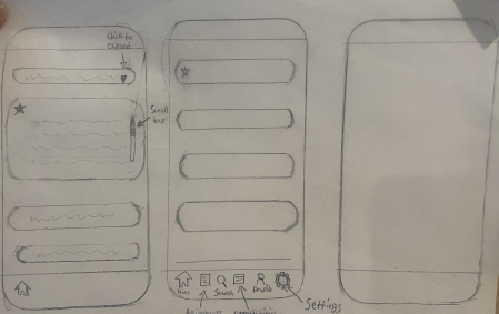
Lo-Fidelity Wireframes
With the key user needs identified and no existing solutions effectively addressing them, we shifted our focus to designing, iterating, and refining our concepts. In addition to creating low-fidelity wireframes, we also mapped out their flow to ensure a seamless user experience and better visual clarity throughout the design process. This approach allowed us to identify potential usability issues early on, streamline navigation, and create a solid foundation for future iterations.


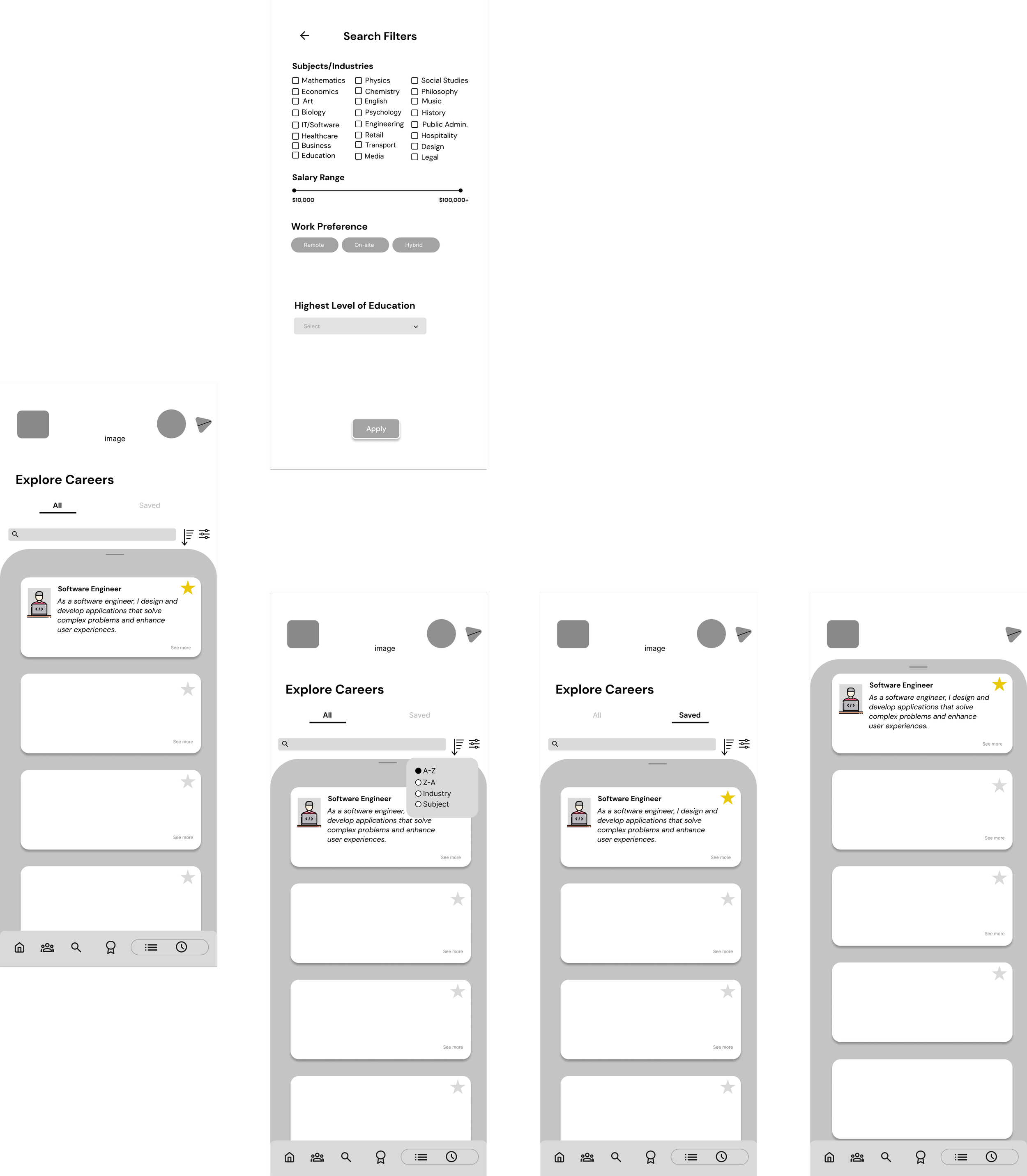
Usability Testing
Due to time constraints, we focused on testing filters and career/opportunity card displays. Testing filters was key because improving one page would allow us to apply changes to others, as the app had many filter pages. We tested the career cards for the same reason—most experiences involved cards and text, so optimizing this feature would benefit multiple areas of the app. We gathered feedback from five users who matched our personas.
Here’s what we found:


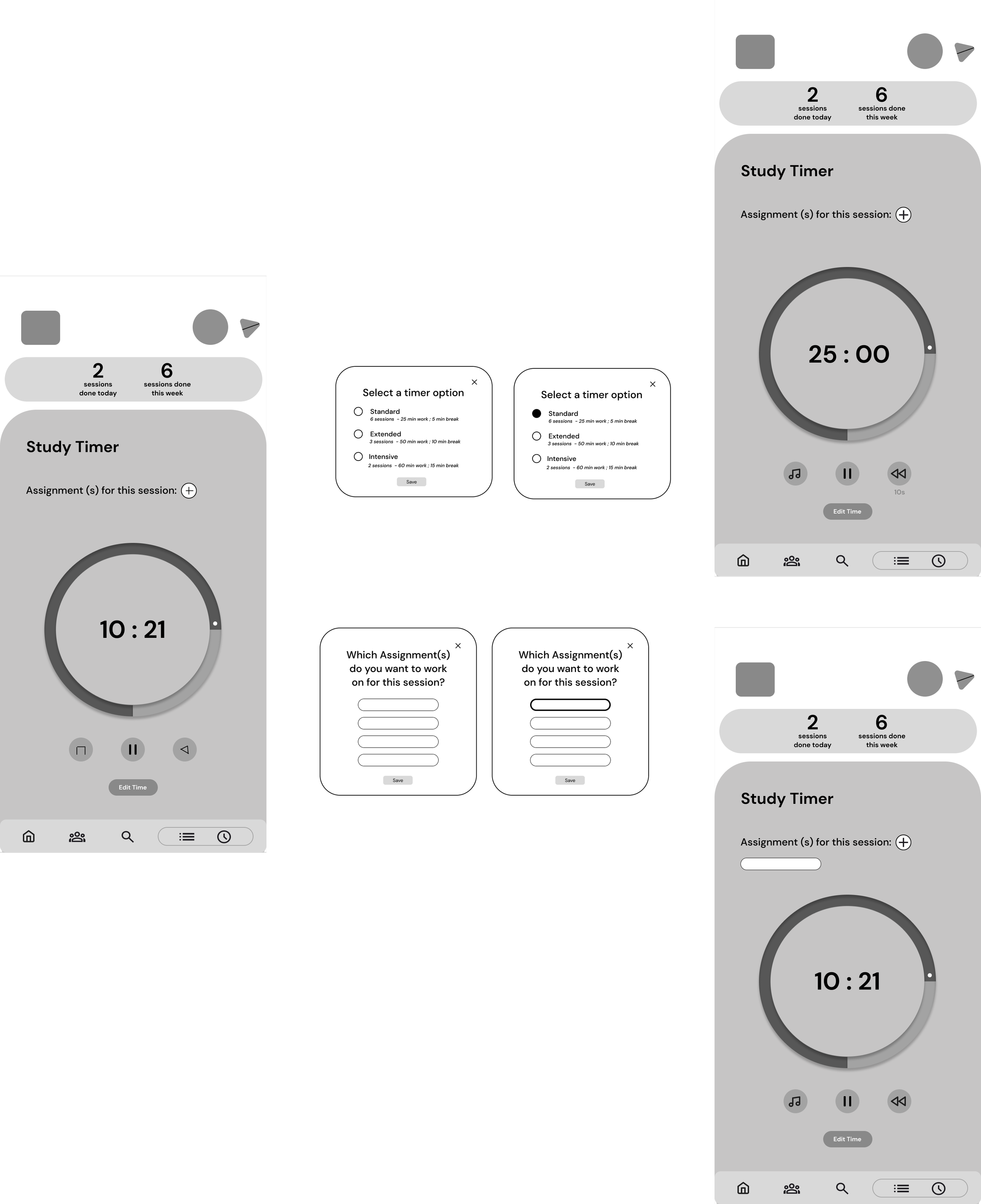
Walkthrough of Final Design
With all that said and done, here’s a walkthrough of the final app prototype!
Reflections
Really understanding what our users need
This project taught me the importance of prioritization and simplicity. During brainstorming, my students and I generated many ideas, but we had to focus on features that directly addressed user pain points. I emphasized the importance of grounding every design decision in our research, ensuring the final product stayed user-centric and practical.
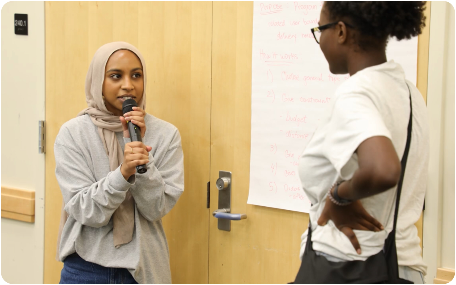
Leading and Teaching
As a mentor, I had to map out weekly lessons and make sure I fully understood everything before teaching it. Juggling design work and guiding students was tough, but it helped me grow a lot in both UX and leadership.
From Design to Impact
This project is definitely one I’m really proud of. It pushed me to level up my skills in design, research, and leadership while helping students learn key UX principles. It was so rewarding seeing them light up when they figured out how to make the card flip in the prototype or when they saw how much the issues they were designing for resonated with them. It was an amazing experience, and I’m excited to share some pictures from our journey below!