Reimagining Grainger's Cutomer Set up Form

Reimagining Grainger's Cutomer Set up Form

At Grainger branches, employees create customer accounts face-to-face on screens mirrored to the customer. I redesigned the Customer Setup Form around the moments where that collaboration became a privacy risk—protecting sensitive entry while keeping customers part of the process.

TIMELINE

3 months (Jan 2025-Aug 2025)

ROLE

UX Design Intern

CLIENT

Grainger

Reimagining Grainger's Cutomer Set up Form

At Grainger branches, employees create customer accounts face-to-face on screens mirrored to the customer. I redesigned the Customer Setup Form around the moments where that collaboration became a privacy risk—protecting sensitive entry while keeping customers part of the process.

TIMELINE

3 months (Jan 2025-Aug 2025)

ROLE

UX Design Intern

CLIENT

Grainger

01
/04
it starts with two screens.
The employee fills out the form while the customer sees the same screen.
EMPLOYEE
CUSTOMER

02 - CONTEXT

one form, mirrored across two screens.
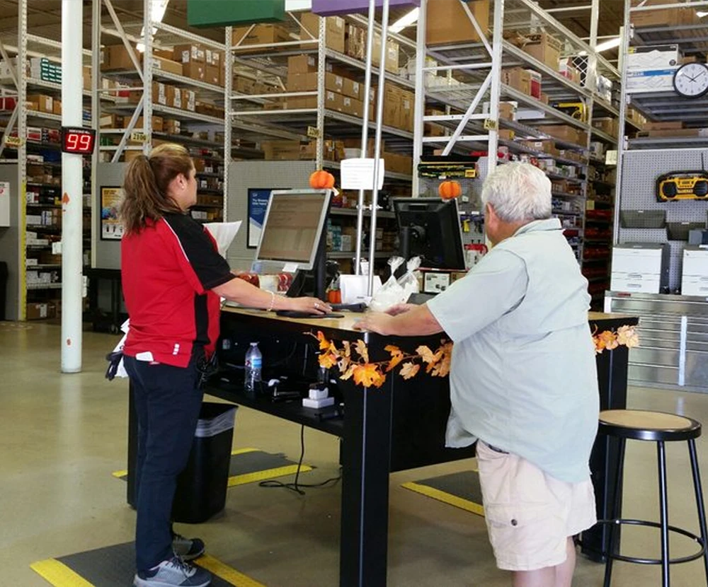
At a Grainger branch, account setup happens face-to-face, with the employee’s form mirrored onto a customer-facing monitor.
THE CATCH
That works—until the information on screen becomes private.
The safeguard depended on one thing:
the employee remembering to turn the monitor off.
Project visual
Project visual

Privacy depended on employees consistently following the proper procedures.

Employees were expected to turn off the customer-facing monitor when entering sensitive information. However, during my branch visit, I observed this was not consistently practiced.

03 - PROBLEM

FOR THE USER
0%
TASK COMPLETION
Critical Customer Setup Form tasks completed successfully during testing.
FOR THE WORKFLOW
0%
FLOW SIZE
Fewer steps after simplifying the privacy flow through iteration.
FOR THE PRODUCT TEAM
0
UX BUGS
UX issues identified and picked up by engineering.
01
THE EXPOSURE
private data, still in view.
02
THE INTERRUPTION
privacy came at the cost of flow.
03
THE REVIEW
no clear moment to check.
Customer setup workflow
Here’s what an employee
at the branch said
I know I need to turn it off. I’m just doing five other things at the same time.
06 - TURNING POINT
from manual protection to a guided flow.
The easiest fix was another reminder, but observation revealed the real issue was that privacy still depended on employees noticing it and acting at exactly the right moment. So, I moved privacy into the workflow itself.
04 - APPROACH
understand the behavior before redesigning the screen.
I did not start with another warning. I first needed to understand why the existing safeguard broke down in practice.
MY APPROACH
05 - RESEARCH
01: auditing the existing experience.
I audited the form to find where sensitive information was exposed and privacy relied on employee memory. At first, the solution seemed simple: add another reminder.
Customer Setup Form audit
HOVER OVER A BLUE POINT TO EXPLORE THE AUDIT
02: cutting the flow.
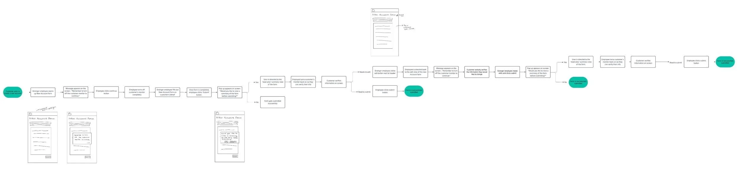
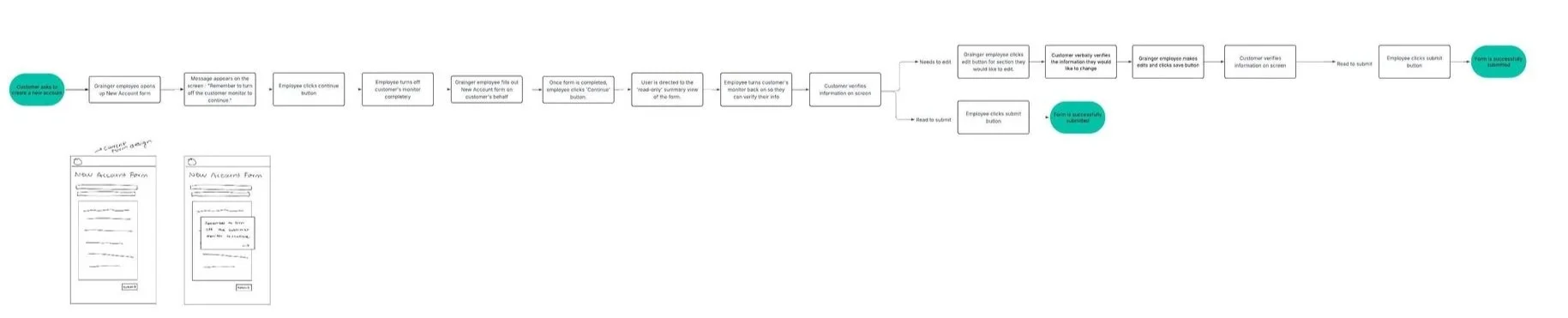
My first flow added too many steps in an effort to make privacy safer. I simplified it to keep privacy built in while making the experience faster and easier for employees.
50%
fewer steps in the final flow
INITIAL FLOW
too many decisions
Initial longer flow
CUTTING THE NOISE
SIMPLIFIED FLOW
50% fewer steps
Simplified final flow
fewer decisions · clearer path
07 - DECISIONS
the details mattered most at the moments where behavior had to change.
I focused iteration around two moments where behavior needed to change.
01
DESIGN DECISION 01
make the privacy moment impossible to miss.
I tested how explicit the monitor-off message needed to be so employees would actively respond instead of passively overlooking it.
DESIGN DECISION 01 Final — Action-first overlay
WHY THIS WON →
Privacy needed to feel like a step in the workflow, not another piece of guidance.
02
DESIGN DECISION 02
turn the final screen into a review, not another form.
I simplified the read-only experience so customers could verify information quickly without navigating the full editable form again.
DESIGN DECISION 02 Final — Structured review
WHY THIS WON →
The customer needed a clear moment to verify information—not another version of the form to navigate.

08 - FINAL FLOW

A guided privacy flow that separates sensitive input from customer input

Enhance your project showcases with tailored descriptions that provide context and highlight key aspects of your process.

Step 1

Firstly, a branch member receives a notification to turn off the monitor before they continue to the form.

Step 2

Step 3

Step 4

Step 5

Step 6

10 - REFLECTION
the screen was only half the work.
WHAT I LEARNED
This project taught me to design inside the messier parts of enterprise UX — security constraints, branch behavior, engineering tradeoffs, and business risk.
FIELD TESTED
REAL WORKFLOW
BEYOND THE SCREEN
THE PROCESS
it wasn’t linear.
01
The process wasn’t linear.
02
An audit gave me one answer; field research challenged it.
03
Concepts got cut. Flows got smaller.
04
Decisions got sharper once I stopped treating the Figma file as the whole system.
WHAT STUCK
That’s what I took from Grainger: good product design has to survive the real workflow, not just the prototype.
TAKEAWAY
Design for the system around the screen.
FOR THE USER
0%
TASK COMPLETION
Critical Customer Setup Form tasks completed successfully during testing.
FOR THE WORKFLOW
0%
FLOW SIZE
Fewer steps after simplifying the privacy flow through iteration.
FOR THE PRODUCT TEAM
0
UX BUGS
UX issues identified and picked up by engineering.

09 - IMPACT

THE SOLUTION

A guided privacy flow that separates sensitive input from customer input

Enhance your project showcases with tailored descriptions that provide context and highlight key aspects of your process.

Step 1

Firstly, a branch member receives a notification to turn off the monitor before they continue to the form.

Step 2

Step 3

Step 4

Step 5

Step 6

01
/04
it starts with two screens.
The employee fills out the form while the customer sees the same screen.
EMPLOYEE
CUSTOMER

02 CONTEXT

02 - CONTEXT

02 - CONTEXT

one form, mirrored across two screens.

one form, two screens.

one form, mirrored across two screens.

one form, mirrored across two screens.

At a Grainger branch, account setup happens face-to-face, with the employee’s form mirrored onto a customer-facing monitor.
THE CATCH
That works—until the information on screen becomes private.
The safeguard depended on one thing:
the employee remembering to turn the monitor off.
Project visual

03 - PROBLEM

03 - PROBLEM

Privacy depended on memory.

Privacy depended on memory.

Privacy depended on memory.

Employees knew what they were supposed to do. But in a live customer interaction, protecting information meant noticing the right field and knowing when to bring the customer back in (which was not happening).

Employees knew what they were supposed to do. But in a live customer interaction, protecting information meant noticing the right field and knowing when to bring the customer back in (which was not happening).

This created 3 problems:

01
private data, still in view.
02
privacy came at the cost of flow.
03
no clear moment to check.
Customer setup workflow
Here’s what an employee at the branch said
I know I need to turn it off. I’m just doing five other things at the same time.
04 - APPROACH
understand the behavior before redesigning the screen.
I did not start with another warning. I first needed to understand why the existing safeguard broke down in practice.
MY APPROACH
05 - RESEARCH
01: auditing the existing experience.
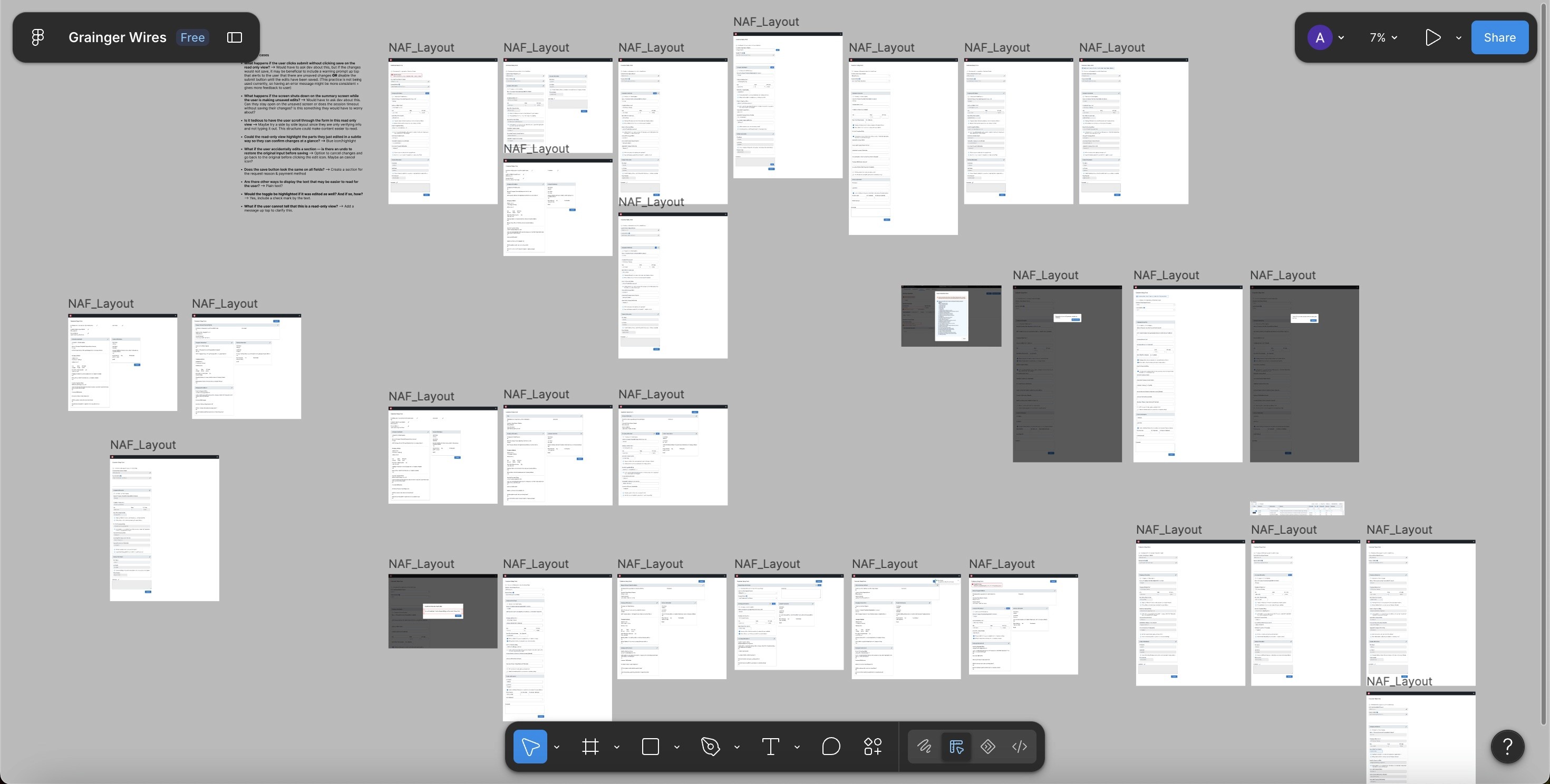
I audited the form to find where sensitive information was exposed and privacy relied on employee memory. At first, the solution seemed simple: add another reminder.
Customer Setup Form audit
HOVER OVER A BLUE POINT TO EXPLORE THE AUDIT
02: cutting the flow.
My first flow added too many steps in an effort to make privacy safer. I simplified it to keep privacy built in while making the experience faster and easier for employees.
50%
fewer steps in the final flow
INITIAL FLOW
too many decisions
Initial longer flow
CUTTING THE NOISE
SIMPLIFIED FLOW
50% fewer steps
Simplified final flow
fewer decisions · clearer path

03 - THE PROBLEM

Privacy depended on employees consistently following the proper procedures.

Employees were expected to turn off the customer-facing monitor when entering sensitive information. However, during my branch visit, I observed this was not consistently practiced.

Project visual
Project visual

THE CHALLENGE

Privacy shouldn't come at the cost of a good customer experience.

So, how might we redesign the workflow to protect sensitive data without disruptions?

Keep It Conversational

Guide employees through privacy steps without interrupting the natural customer interaction.

Reduce Cognitive Load

Make privacy actions simple and intuitive, so employees don’t have to think twice.

Standardize Privacy

Create a consistent privacy workflow that works across every Grainger branch.

Keep It Conversational

Guide employees through privacy steps without interrupting the natural customer interaction.

Reduce Cognitive Load

Make privacy actions simple and intuitive, so employees don’t have to think twice.

Standardize Privacy

Create a consistent privacy workflow that works across every Grainger branch.

01
THE EXPOSURE
private data, still in view.
02
THE INTERRUPTION
privacy came at the cost of flow.
03
THE REVIEW
no clear moment to check.
Customer setup workflow
01
THE EXPOSURE
private data, still in view.
02
THE INTERRUPTION
privacy came at the cost of flow.
03
THE REVIEW
no clear moment to check.
Add project image
06 - TURNING POINT
from manual protection to a guided flow.
The easiest fix was another reminder, but observation revealed the real issue was that privacy still depended on employees noticing it and acting at exactly the right moment. So, I moved privacy into the workflow itself.
06 - TURNING POINT
building privacy into the flow
The easiest fix was another reminder, but observation revealed the real issue was that privacy still depended on employees noticing it and acting at exactly the right moment. So, I moved privacy into the workflow itself.
04 - APPROACH
understand the behavior before redesigning the screen.
I did not start with another warning. I first needed to understand why the existing safeguard broke down in practice.
MY APPROACH
07 - DECISIONS
the details mattered most at the moments where behavior had to change.
make the privacy moment impossible to miss.
I tested how explicit the monitor-off message needed to be so employees would actively respond instead of passively overlooking it.
DESIGN DECISION 01 Final — Action-first overlay
WHY THIS WON →
Privacy needed to feel like a step in the workflow, not another piece of guidance.

08 - FINAL FLOW

A guided privacy flow that separates sensitive input from customer input

Enhance your project showcases with tailored descriptions that provide context and highlight key aspects of your process.

Step 1

Firstly, a branch member receives a notification to turn off the monitor before they continue to the form.

Step 2

Step 3

Step 4

Step 5

Step 6

A guided privacy flow that separates sensitive input from customer input

Enhance your project showcases with tailored descriptions that provide context and highlight key aspects of your process.

08 - FINAL FLOW

Step 1

Firstly, a branch member receives a notification to turn off the monitor before they continue to the form.

Step 2

Step 3

Step 4

Step 5

Step 6

08 - FINAL FLOW

08 - FINAL FLOW

the moments that changed the workflow.

the moments that changed the workflow.

Enhance your project showcases with tailored descriptions that provide context and highlight key aspects of your process.

Enhance your project showcases with tailored descriptions that provide context and highlight key aspects of your process.

Step 1

Firstly, a branch member receives a notification to turn off the monitor before they continue to the form.

Step 2

Step 3

Step 4

Step 5

Step 6

09 - IMPACT

09 - IMPACT

FOR THE USER
0%
TASK COMPLETION
Critical Customer Setup Form tasks completed successfully during testing.
FOR THE WORKFLOW
0%
FLOW SIZE
Fewer steps after simplifying the privacy flow through iteration.
FOR THE PRODUCT TEAM
0
UX BUGS
UX issues identified and picked up by engineering.
10 - REFLECTION
the screen was only half the work.
WHAT I LEARNED
This project taught me to design inside the messier parts of enterprise UX — security constraints, branch behavior, engineering tradeoffs, and business risk.
FIELD TESTED
REAL WORKFLOW
BEYOND THE SCREEN
THE PROCESS
it wasn’t linear.
01
The process wasn’t linear.
02
An audit gave me one answer; field research challenged it.
03
Concepts got cut. Flows got smaller.
04
Decisions got sharper once I stopped treating the Figma file as the whole system.
WHAT STUCK
That’s what I took from Grainger: good product design has to survive the real workflow, not just the prototype.
TAKEAWAY
Design for the system around the screen.
07 - DECISIONS
the details mattered most at the moments where behavior had to change.
make the privacy moment impossible to miss.
I tested how explicit the monitor-off message needed to be so employees would actively respond instead of passively overlooking it.
DESIGN DECISION 01 Final — Action-first overlay
WHY THIS WON →
Privacy needed to feel like a step in the workflow, not another piece of guidance.
Here’s what an employee at the branch said
I know I need to turn it off. I’m just doing five other things at the same time.

09 - IMPACT

made with curiosity,
sticky notes,
& lots of iteration :)

let's design incredible work together.

let's design incredible work together.